Today an article was posted at NZZ Campus about the scholarship initiative on which will be voted on June 14th 2015.
I was with a group of students and we did a little canvass where we wrote the words “Faire Stipendien!” with laying bodies on the ground (faire scholarships!).
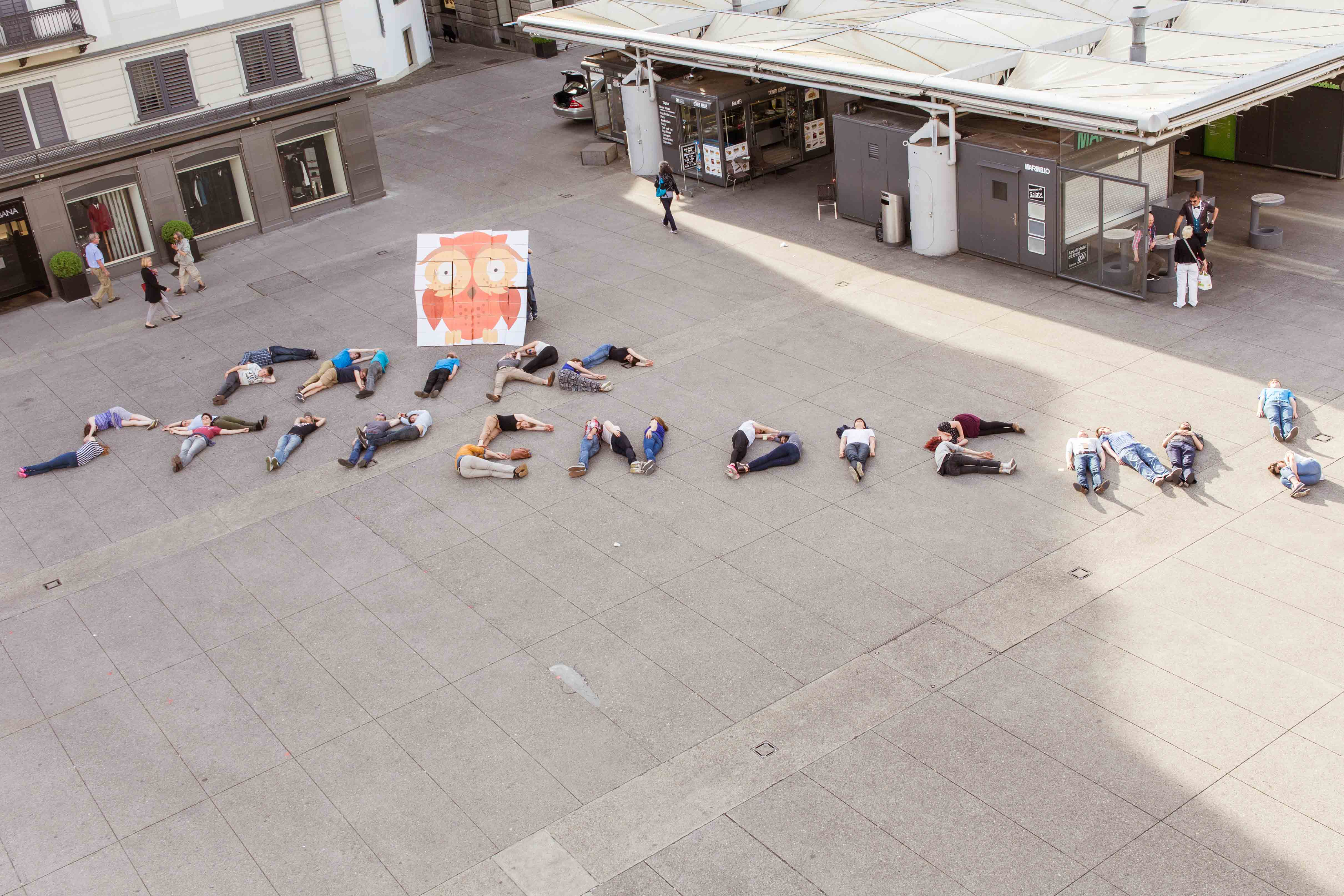
Here is the original sent picture to the press:
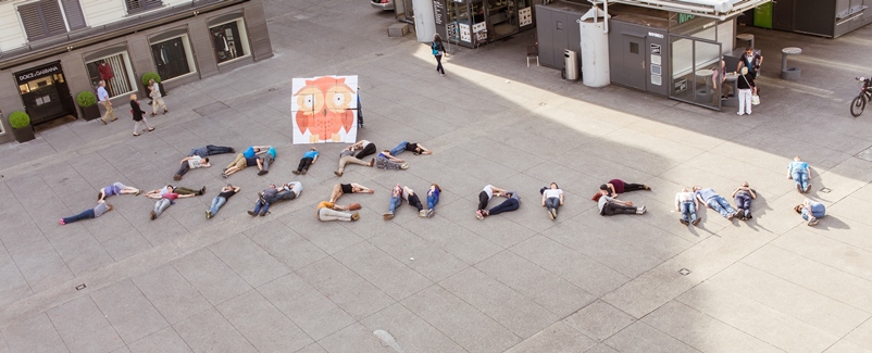
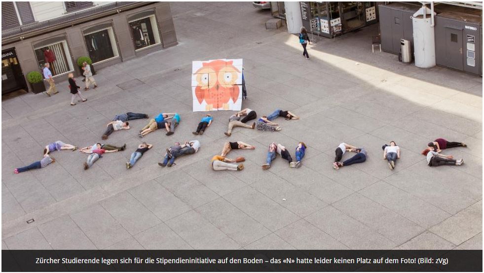
Now NZZ Campus cut of the end of the letters in the picture since it didn’t fit their frame on their website and wrote as a subtitle to it: “Zürcher Studierende legen sich für die Stipendieninitiative auf den Boden – das «N» hatte leider keinen Platz auf dem Foto! (Bild: zVg)” which means in English as much as “Students of Zurich laying on the ground for the scholarship initiative – the «N» had sadly no space on the picture”.
Now, and this is for NZZ Campus, only because your website is not flexible enough to handle different types of aspect ratios by pictures does not mean you just write than that the «N» didn’t had its space! And that only because your website is too stupid to handle different aspect ratios? Shame on you!
Here are a few creative ideas for you, how you could have solved the problem. Of course I do them for you at the same time!
First step:
Communication 1.0… ask for a different aspect ratio of the picture! Like this:
If first step does not work, go to the second one:
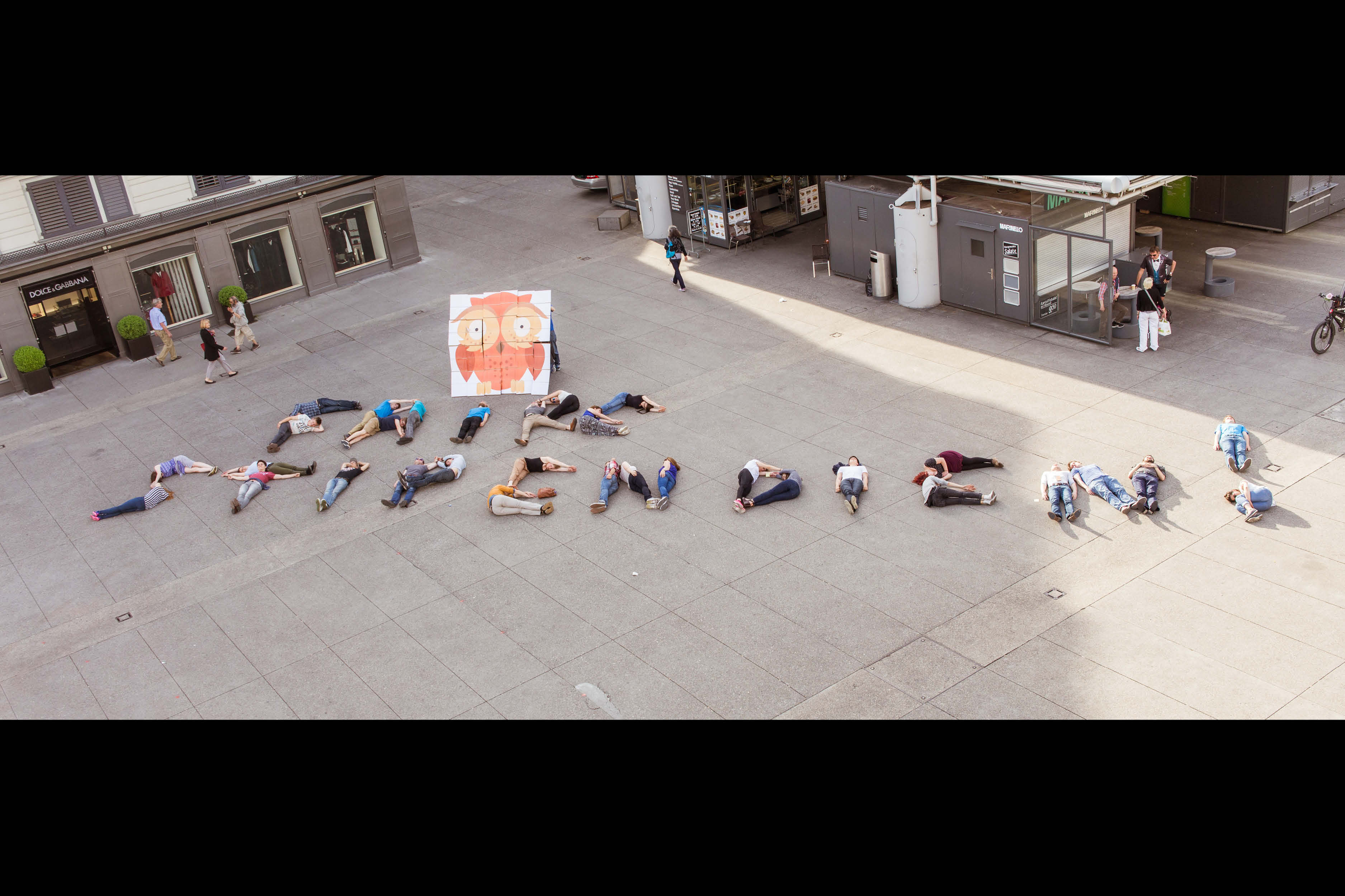
Put the picture with a white frame on top and bottom at your website.
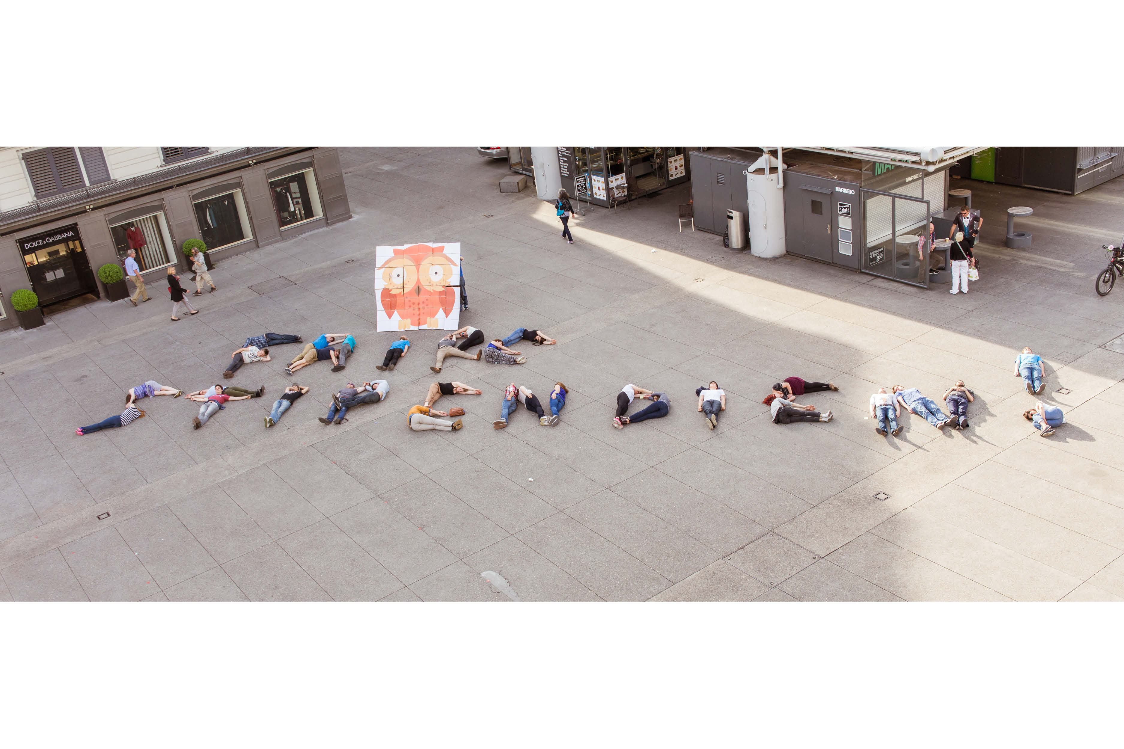 or with a black one
 or even with a pink one
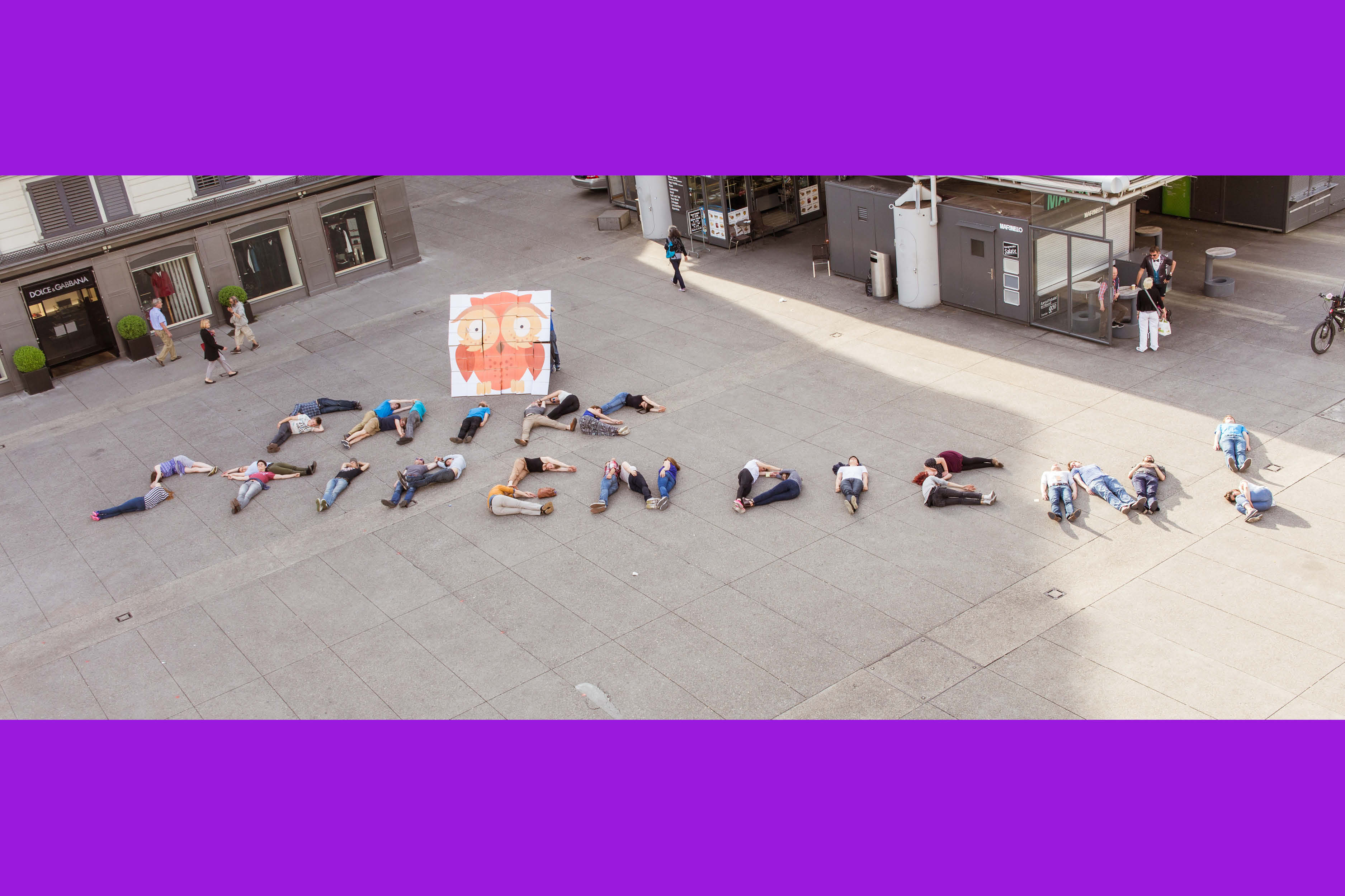
I hope that helps. I save my thoughts about the comment on the right side of the article.
Cheers
Lieber Michael
Besten Dank für die Nachhilfe. Wir haben in der Tat, wie eben telefonisch besprochen, nur Bilder erhalten, auf denen das N in 16:9-Format nicht mehr zu sehen war. Nun, da du uns freundlicherweise weiteres Material zur Verfügung gestellt hast, haben wir das Bild ausgetauscht. Besten Dank. Mit Querbalken operieren wir nicht. Obwohl: Pink, das wäre mal eine Überlegung wert. #clickbait #nichternstgemeint
Robin Schwarzenbach, NZZ Campus